Showing posts with label portfolio. Show all posts

Friday, December 11, 2009

Our student film "Escape From the Hamster Wheel"

This was a group project at Billy Blue College of Design for "Digital Video Composition and Storytelling" class with Damian Blayney. 
Team members include:
+ Nitesh Asrani
+ Francois Hebert
+ Lina Hallberg
+ Alex Ball
+ Tatyana Temirbulatova
+ Danilo Toledo


We were given stock footage of the Billy Blue graduate exhibition, and the assignment was to produce a movie of 2 mins incorporating this footage.

The work involved writing the script, creating storyboards and shot lists, shooting our footage (of course!), cutting and editing. We also included a pre-movie animation, done by Alexander Ball, which introduced viewers to the story.

Friday, September 18, 2009

Calliope Animatic


This was a group project to digitally illustrate one of Neil Gaiman's Sandman stories. Our team was called "The People" and it consisted of Francois Hebert, Phil Sheather and Steve Milne...well and myself of course :)

The process for making this animatic was first to brainstorm on the style that we wanted to convey. We decided on Film Noir style, as we felt it reflected the mood of the story and we also found it visually inspiring. This was followed by storyboarding, image sourcing and production hours. The last bit was to add music, which Steve handled beautifully. Production was done using AfterEffects.

Semester 2: "Form and Object Studio" with Toby Whitehead

Friday, September 11, 2009

Grasshopper 3D model in Maya 2009


This is the Grasshopper I've modeled in Maya 2009 as part of the "3D Design Theory 1: Planning and concept development" class at Billy Blue. To be honest, this is my first digital modeling project, but I am very happy with the result. I used to do ceramics in High School and I noticed that I had quite the talent for it, but I couldn't figure out how I would make a profession out of it.

Maybe this is the answer...pixel-clay of 3D modeling...

Semester 3: "3D Design Theory 1: Planning and concept development" with Jonathan Gunawan

I slept with Peter

With Peter Alexander, that is. The Pyjama King.

Well, I slept with Peter metaphorically speaking, by wearing his incredibly fun PJs. Actually, I did a research project about Peter Alexander for "Intro to Design Research" class. The task was to research a contemporary artist and create A3 poster, reflecting that artist's inspirations in 700 words or more.


The idea for the poster is based on Peter's early inspiration by cream & black spotted pyjamas he picked up in Hong Kong. The poster was folded like a pyjama at a store and wrapped in PA wrapping paper.

Essay
Art has many faces. Critics often disagree on the exact definition of art, but one thing is for certain. If a person creates something new, something that reflects his internal world, and if this something evokes an emotional response in you, then this person is an artist. Peter Alexander is one of those contemporary creators, whose medium of choice is...pyjamas! Born in 1965 in Australia, Peter has given sleepwear a new definition. In 1987 he started a mail-order pyjama business, which in the last 20 years has grown into an international brand with retail stores and celebrity recognition. How does he do it? Where does he find the inspiration to produce successful designs time and time again? The following text explores the magic behind Peter Alexander brand, and delves into what fuels his imagination.

The catalyst to creating pyjama fashion label was a chance trip to Hong Kong that Peter took with his father, when he was a teen. While at Hong Kong, Peter picked up a pair of cream and black spotted pyjamas at a Japanese department store, and he was “struck by how incredibly cute they were”. Years later Peter was looking for a product to market, and he remembered his Hong Kong inspiration. Starting with a small internet mail-order business, Peter has grown into an international brand with standalone stores and a huge fan base. Yet even now, travel remains one of the main sources of inspiration for Peter. Seeing different cultures, patterns and colour combinations feeds his ideas and creativity.

Peter also recognises the supportive power of family and friends. He speaks affectionately of his mother as being his first employee. He loves to recall starting out on his mother’s dining-room table. Now that Peter Alexander is a huge business, Peter’s mum is still a source of creative guidance and inspiration to him. She often comes by the office to look through the latest designs and offer her opinion. For example, Peter started making the popular larger sizes after his mum’s remark that none of the current sizes fit her. Another encouraging hand in Peter’s journey was a friend Aviva, who helped him break into the fashion industry. When Peter started out, he didn’t know how to sew and where to even begin with fabric selection. It was his family and friends who gave him necessary support at that critical time.

Another source of inspiration and ideas for Peter comes in a form of fuzzy fur and wagging tales. In 1997 Peter met Penelope, his “beloved sausage dog”. She soon became the brand mascot, and sausage-dog images frequently make their appearance in pyjama patterns, shopping bags and wrapping paper. Peter often brings his dogs to the office, and he allows his employes to bring their dogs as well. However, Peter has great respect for the animals and he does not see them as fashion accessories. He is hesitant make doggie t-shirts, even though they would certainly be an instant hit. Additionally, his website contains an entire section called “Animal Friends” where he provides information about his dogs and ways of caring for the animals. This year (2009) Peter Alexander joined forces with Katherine Heigl to raise money for dog shelters. In his own words, I “love nothing more then waking up to a big lick on the cheek and believe ‘dogs’ truly are ‘gods’ spelt backwards!”

To Peter, the essence of inspiration is in the world around him. He loves walking down the street and observing how people combine their clothes. He is intrigued by the stories behind the clothing, as he strives to tell a story with each design he makes. A lot of his creativity comes to Peter when he is cozied up in bed. He often sleeps with a notepad next to his pillow to remember those ideas that come between dreaming and waking. Additionally, Peter follows trends in fashion magazines and applies them to his work, but he prefers to infuse them with a sense of humour. When asked about his choice of industry, Peter replied, “I think I just really liked the frivolity of fashion and in a way the stupidness of fashion, the fact that it’s about emotion and fun.” When working on a design, Peter always aims to incorporate an element of play and interaction with a product. One example is a tee dubbed “Air Guitar.” It has a print of a guitar on a front with a velcro detachable guitar handle on a side, so the person can tear it off and play pretend guitar. It is Peter’s belief that work should be play, play should life, and life should be enjoyment. This bright and rich outlook on life is reflected in every piece that Peter creates.

Peter Alexander is a beautiful and unconventional artist. His pyjama designs are full of fun and entertainment, as is his life. He draws inspiration from his family and friends, as well as from his animal companions. He enjoys stimulating adventures of travel, and he is open to exploring new cultures and trends. Peter sees opportunities for inspiration in every moment of the day, be it during his trip to the office or just before he falls asleep. “Peter is a rare breed of creativity and business savvy" and he proudly wears his title of Pyjama King.

References
Alexander, P. 2007. Celebrating 20 Years of Sleeping Around, Melbourne Books, Melbourne, Australia

NineMSN 60 Minutes. 2009. Chat: Peter Alexander (Online)
Available: http://sixtyminutes.ninemsn.com.au/article.aspx?id=758956 (accessed August 30, 2009)

Peter Alexander Pyjamas & Clothing (Online)
Available: http://www.fashionreview.com.au/peter-alexander-fashion-designer/ (accessed August 27, 2009)

Peter’s World. 2009 (Online)
Available: http://www.peteralexander.com.au/tem/PA_petersworld.tem (accessed September 3, 2009)

Sydney Morning Herald. 2008. Peter Alexander - The Pyjama Game (Online)
Available: http://media.smh.com.au/executive-style/top-line-living/peter-alexander--the-pyjama-game-318689.html (accessed September 1, 2009)

Semester 3: Introduction to Design Research with Suzanne Keating

Monday, August 3, 2009

Are you well hung?

The Brief
Pick a typography rule out of a hat and design A3 poster communicating the rule. The copy limitation is 300 words, and the post must have a hand-rendered element to it.

Design Outcome
I originally pulled out "headers and sub-headers," but the caveat was that we could trade the rules amongst ourselves, and I finally ended up with "hanging punctuation." Yes! I've explored a few ideas, such as "hanging here does not mean death by suspension, but failure to use it could be fatal to your design reputation." But I keep hearing that sex sells, so I went with "are you well hung?"

I actually cut out the woman shape, the letters and boxes with a scalpel, and the top part is a pattern made of felt (I bought it, hehe). There is also a string of jewels at the very top to add dimension. Much of the inspiration for my Semester 2 work came from paper crafts and scrapbooking, including this one.


Semester 2: Typography with Jodie Richards

Wednesday, July 29, 2009

Crow & Fox: re-discover wisdom through poetry

The Brief
Pick a children's story and illustrate it with 4 spreads, and design the book cover for it. The goal is to make the illustrations interesting for children, colourful and fun. The medium for the work is line and wash.

Illustration Outcome

I selected to illustrate a Russian fable that I memorized when I was a kid. It's called "Crow & Fox," and it explores the cunning power of flattery. Of course, I needed to translate it as well, which I did during my morning runs by trying out different lines in my head over and over again. I've also brought the fable to Aussie context, cause I am in Sydney after all, and I've used Snowgum trees as the setting.

Well, here it is, my creation.


How many times the world was told,
That flattery is cunning art,
But all in vein, and to the person's heart,
The flattery is solid gold.

One day, God sent the Crow a slice of cheese.


The Crow flew up a snowgum and picked a comfy stick.
Preparing to eat the cheese with pleasure.
But clever Fox too smelled delicious treasure.
She tracked the snowgum, and then thought up a trick.


The Fox spoke sweetly to the Crow,
"What beauty! If only you could also sing,
We would select you forest King!
Please sing for us, give us a show.


The Crow lost his head with such intoxication.
To be a King, now that's a worthy goal!
With all his might he made a loud "Caaaww..."
And cheese fell right into the Fox's teeth.


And here is the original Russian version, just for a good measure :)

ВОРОНА И ЛИСИЦА
Уж сколько раз твердили миру,
Что лесть гнусна, вредна; но только все не впрок,
И в сердце льстец всегда отыщет уголок.
Вороне где-то бог послал кусочек сыру;
На ель Ворона взгромоздясь,
Позавтракать было совсем уж собралась,
Да позадумалась, а сыр во рту держала.
На ту беду, Лиса близехонько бежала;
Вдруг сырный дух Лису остановил:
Лисица видит сыр, -
Лисицу сыр пленил,
Плутовка к дереву на цыпочках подходит;
Вертит хвостом, с Вороны глаз не сводит
И говорит так сладко, чуть дыша:
"Голубушка, как хороша!
Ну что за шейка, что за глазки!
Рассказывать, так, право, сказки!
Какие перышки! какой носок!
И, верно, ангельский быть должен голосок!
Спой, светик, не стыдись!
Что ежели, сестрица,
При красоте такой и петь ты мастерица,
Ведь ты б у нас была царь-птица!"
Вещуньина с похвал вскружилась голова,
От радости в зобу дыханье сперло, -
И на приветливы Лисицыны слова
Ворона каркнула во все воронье горло:
Сыр выпал - с ним была плутовка такова.

Semester 2: Form and Object Studio with Gail Rogers Perazzo

Saturday, July 25, 2009

Sea Creature

The Brief
Choose any sea creature and create a short animation of the creature swimming around. The animation must include Action Script controls and two buttons.

Animation Outcome
I am fond of turtles, so I made a cute little turtle swimming around. It's inspired by my scuba diving experiences and colorful cartoons.

NOTE: to stop/restart the animation, please refresh the page!


Please install Flash plugin


Semester 2: Internet Technologies with Dawn Pugh

Saturday, April 25, 2009

The Wolf - texture & line

The Brief
Working from a B&W photo with high contrast, we were to re-create the image and mainly the texture of the animal using technical pens. I used a set of four Staedtler pigment liners sized 0.1 mm, 0.3 mm, 0.5 mm and 0.7 mm respectively.

Rendering Outcome

After about 8 hours over a period of 2 days, I produced this drawing.


I am happy with the way it came out, and most importantly I enjoyed the process. A lot.

After about 10-15 mins you go into a zone where only lines and marks exist. It's like a form of meditation, when the mind is quiet and only shapes matter.

Semester 2: Form and Object Studio with Gail Rogers Perazzo

Sunday, April 19, 2009

Perspective Wash

The Brief
The goal of this assignment was to learn the rules of perspective using two vanishing points, as well as observe the effects of light at different times of the day. We were to paint a night scene and either a rainy day or a sunrise/sunset.

The base of the drawing was done at location, after which I refined the lines and composition at home. I returned to that street a couple times more to photograph it in the evening. For the sunrise, I just used my imagination, lol.

Painting Outcome
Both paintings were done on Arches Watercolor Medium 185 GSM paper. Great to do wash on! It holds water for a long time, and it's pretty forgiving with re-wetting if I decide to change my mind on the color. Best part, this weight of paper can be put in the printer for a quick transfer of the image lines.

Here is the early night with some lights in the windows. They bring comfort and interest to the night.


And here is the early morning, when lines and colors are soft and the sky is just starting to light up with warm pink.


Semester 2: Form and Object Studio with Gail Rogers Perazzo

Friday, February 27, 2009

"Hair of the Dog" beer label design

The Brief
Design and complete a logo plus front/back/neck labels for a new designer beer that is coming onto the market. The style of bottle is for a long neck bottle. The design should be "bright and colorful" aimed at the younger 25-35 year-old drinkers and should therefore be upmarket and current.

Design Outcome
The logo and label design were created in Adobe Illustrator CS3, using shapes and some hand-drawn elements.


Semester 1: Language and Systems of Communication, taught by Rob Tossen

Tuesday, February 24, 2009

Russian folk tale illustration

Tale of Swan Geese
also known as "Gusi Lebedi", Гуси Лебеди

Getting is touch with my roots... this is what this assignment was about. As designers, we have to tap into our unique backgrounds and characters to produce something new, personal and satisfying for clients and ourselves.

To create this tale illustration, we had to look into the history of our ancestors and select a folk tale to be re-told using 6 illustrations. Each illustration used a different medium, which I list under the each illustration. The first is a symbol from Russian Art style called "Hohloma" and I rendered it using gouache paints. This symbol (or its parts) will subsequently appear in all illustrations, see if you can spot it ;)

Gouache on watercolor paper

The Story
"Zhili bili..." that's the classic beginning of a Russian tale, which literally translates to "There lived, there existed". So let's stay true to the traditions and start with that.

There lived, there existed a grandma and grandpa with two small grandchildren. The young boy was named Ivanushka, and his older sister was called Alenushka. One day they were playing outside of the house, when mean birds called "swangeese" came and stole the little Ivanushka!

Watercolor on watercolor paper

Desperately Alenushka tried to catch the birds, but they were long gone. Worried, she set out on a journey to find her brother. As she walked, she met a River of Milk.
"Alenushka, have some of my delicious milk," said the River.
"No way, my Daddy has yummier milk." And she went on.

Later she came across an Apple Tree and a Baking Oven. Each offered her their gifts, but Alenushka just turned her nose away and said that her Daddy has better.

Acrylic on watercolor paper

And so she went on... Towards the end of the day, Alenushka came across a House on Chicken Legs, where Baba Yaga lives. She was terribly scared, but she loved her brother very much, and she she went in. Ivanushka was sitting in a pot ready to be cooked (!!!), while Baba Yaga was organizing her spices.

Alenushka felt a small tickle on her leg, and she saw a little mouse speaking to her.
"Alenushka, give me some of your bread, and I'll distract Baba Yaga so you can escape!"
This sounded like a fine deal, and Alenushka shared her bread with the little mouse. In this moment, Alenush learned a very important lesson of sharing and gratitude. Without waisting a moment, she grabbed Ivanushka by the hand, and ran out of the house.

Collage and acrylic on watercolor paper

Again the brother and sister came across the River, the Apple Tree and the Baking Oven. However, this time they accepted their gifts and said "Thank You." In appreciation of their kindness, the River, the Apple Tree and the Baking Over hid the kids from the chasing birds.

Collage and typography on watercolor paper

When the kids arrived home safely, their parents were very happy to see them. They huged and kissed the children, who learned a very important lesson that day.

Typography print on scanned watercolor texture

Semester 1: Design Culture and Theory taught by Annette Lodge

Painting in the style of October Revolution

The brief requested us to pick a 20th century artist and act as if we were that artist. We had to create an art piece in the style of the chosen person, and then use this artwork in a Graphic Design treatement. Part of the task was to invent the project for which the artist was commissioned. Finally, we performed a play in a group of 4 people impersonating the artist, but we won't include it here ;).

I chose to be Natalia Goncharova, a Russian avant-darde painter. I was commissioned to do a wall piece for a revolutionary society "Donkey's Tail". This was the first part of my project. For the second part I designed 4 postal stamps using the painting.

Below is the painting, acrylic on canvas, followed by the 4 stamp designs done in Photoshop CS3 and InDesign CS3.


Notice the texture on the stamps and the old-paper look. I created the "old paper" using a cotton ball dipped in coffee and smudged all around A4 piece of cartridge paper. After the paper dried I ironed it to get the ripples out and scanned it in. For the rough texture look I used the Texturizer filter in Photoshop.


Semester 1: Design Culture and Theory, taught by Annette Lodge

Earrings for each seasons

The Brief
My client is invited to a Seasonal theme party, and she commissioned me to design 4 pairs of earrings corresponding to each season. Money is not an issue, and the only constrain is that I cannot use yellow gold. Additionally, each design must have a distinctive gemstone or crystal.

Here they are, one for each season with gemstones attached. Artwork is executed in watercolor and color pencils, on Arches Watercolor Medium 300 GSM paper.

Spring with Diamond and Citrine

Summer with Amber

Autumn with Red Agate

Winter with Rutilated Quartz

Final Presentation

Semester 1: Design Culture and Theory, taught by Edwina Riddell

Monday, February 23, 2009

Gutenberg pictorial essay

The Brief
Write and design a 700 word pictorial essay on two to three A3 pages on any historical character, typographical innovation or significant technological development during the period starting with the Cave drawings to the period of Art Nouveau.

Design Outcome
I have chosen Johann Gutenberg. The pictorial essay pages were created in the style of Gutenberg's beloved and infinitely magnificent achievement of "Gutenberg Bible."

The old paper texture was created using a piece of A4 cartridge paper and a cotton ball soaked in coffee :) After the paper dried, I ironed it to get the waves out and scanned it in. I then used Photoshop to blow up the image to A3 size.

The floral illustrations were rendered using gouache and color pencils. The font used for the body text is Goudy Text.


View body copy of the essay in a separate post

Semester 1: Peter McGill, Language and Systems of Communication

Buy Nothing Day crosstrack & visual proposal

This is the visual part of the assignment described in my earlier post. In summary, the students created a proposal to Adbusters magazine for designing a crosstrack campaign for Buy Nothing Day (the text of the proposal is included in a separate post).

Below is the PDF file of the final proposal, and the graphics of the crosstrack poster we designed. The work was done in a team of 3 ladies.


Semester 1: Ideas Generation in Visual Communication, taught by Peter Worthington and Matt Leach

Sunday, February 22, 2009

Nomadic magazine cover

The goal here was to use as many Photoshop filters and effects as possible, without regard for aesthetic beauty... But I still wanted to create something that didn't offend the eye :)

The brief asked us to come up with a magazine related to any theme, and create a cover it. I had to ask myself, what do I like the most. Some of the possibilities were healthy eating, herbs or environment, but the topic that truly excites me is travel! Here it is, a magazine about travel, Nomadic.


Semester 1: Language and Systems of Communication, taught by Rob Tossen

Sunday, February 8, 2009

Atalanta and Hippomenes

Part 1: Myth Illustration

The brief asked us to pick a scene from one of the Greek Myths and create an illustration for that scene using at least 2 human figures in action poses, and employing principles of perspective.

I have selected a scene from the story of Atalanta and Hippomenes. The illustration portraits the race between Atalanta and Hipomenes, which decides whether Hipomenes lives or dies, and whether Atalanta gets to know the taste of intimacy. The viewer is positioned in front of the running figures with the road fading into the distance. I felt that this position makes the biggest impact on the viewer, and conveys the intensity and swiftness of the race.

pencil modello

When producing the illustration, my main challenges included deciding on the postures and composition, and then actually getting the figures on paper. Since my composition includes figures running forward, the drawing involved foreshortening and overlapping of masses, which seemed unnatural during sketching, but after stepping away looked realistic. It was also challenging to use the black pen, since the only mark you get from it is black or white, no grey.

Atalanta and Hippomenes illustration (black pen)

The biggest aid in producing the illustration was the use of reference photos. After creating a rough composition, I found numerous images of the items I wanted to depict. I have combined them one by one in the pencil modello, studying each portion in detail. When the time came to doing the final illustration, it was a relatively straightforward process of transferring the shapes and tone from modello to the pen illustration.

Part 2: Written assignment

Relevance Of Traditional Image Creation Techniques On Contemporary Multimedia And Graphic Design

Before an artist can fly, he or she needs to master the skill of walking. Learning the fundamental techniques of image creation is now more important than ever to the digital artists, since it allows them to apply this knowledge to the world of pixels.

The rise of modern technology had caused many young artists to explore the realms of digital image creation. Programs, such as Photoshop and Corel Painter, made it possible to produce dazzling on-screen artworks, with quickness and precision of the computer, yet with human touch of the creator. There are also many online communities, for example Deviant Art, where aspiring artists share their digital works with the world, and stand a chance at being noticed.

In order to shine among the many, these upcoming artists need to solidify their core drawing and image creations skills. They now realize that the best place to learn is from the people who have done this many times, before the computers entered the scene. All of a sudden, Andrew Loomis has become popular and necessary again, and the traditional knowledge base has mixed with the present.

Semester 1: Design Culture and Theory, taught by David Briggs

Monday, February 2, 2009

Logo & Business Card Design

Alas, I am posting my first semester work! Better finish this up before the summer holidays run out :).

This was one of my first projects. We were asked to design a logo for "our business" using only 4 spot colors. We later had to identify the colors using the Pantone books, and trace each color into a separate piece of tracing paper, similar to the way printers use printing plates. I based my design on an Illustration file from iStockPhoto, which I was able to modify to my needs. I added colors, text, and changed some shapes. Great learning experience!


Second part of the assignment was to design a business card using this logo. Voilà...


Semester 1: Intro to Studio Practice, taught by Dave Walch

Wednesday, September 10, 2008

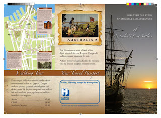
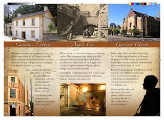
My very first InDesign brochure - "Sydney Convicts"

One of my first assignments for "Language and Systems of Communication" class at Billy Blue was to create a brochure, promoting a walking tour around Sydney. But it's not any kind of tour. This walking trail follows the steps of the convicts that first settled the Australian lands.

After hours of battling and occasional "aha" moments with InDesign, here is what I have come up with. Click on the images below to download a PDF file of the brochure (2.4Mb).

Front and back view:

Inside view:
The PDF file produced is ready for print. It's done using CMYK color mode, and it contains print marks in the edges of the document. It also accounts for the images "bleeding" off the paper, which means the images go beyond the cutting borders to avoid unprofessional while lines between paper edge and the image.

To achieve this "print ready" format, I did the following:
1. When in InDesign, press Command+E to export the file as PDF
2. In the "Export Adobe PDF" window go to "Marks and Bleeds"
3. Check "All Printer's Marks" checkbox

That's all. After saving the exported file, it comes out decorated with all kinds of neat print marks and color scales.

Semester 1: Language and Systems of Communication, taught by Rob Tossen