Tuesday, December 23, 2008

New Years resolutions

Reflecting on everyday experiences is a big part of being a designer, or so my teachers tell me. As for my opinion, it's an absolutely crucial part of being a designer! It's also what makes it fun.

After studying for just one semester I am already noticing big changes in the way I perceive the world around me. When going to the movies, playing video games and traveling, I am no longer a passive observer, but an active participator. The font faces speak to me about their purpose (or lack of it), and a beautiful kaleidoscope of colors and textures inspires unborn designs to come into shape.

I think observation and self reflection is so important, that I am even making a New Years resolution to blog every month about 5 things that inspired me and I think worked well, and 5 things that I see as needing improvement.

So here are my resolutions:
  1. Blog monthly about "the good, the bad and the ugly" of the world around
  2. Draw!!! It's so important for a designer to have solid hand-rendering skills. Plus, as I said in my first ever post, it develops the right side of the brain
  3. Wear colorful clothes; put that color theory knowledge into practice
  4. Eat a serving of spirulina at least every other day
  5. Master Textpattern
Happy Holidays!

courtesy of yandex.com

Friday, December 19, 2008

Animusic Universe

Is this a new form of Art or is it just entertainment? You decide...

The guys at Animusic call themselves "content creation company focused exclusively on computer animation of music." When I saw their music clip on PBS, it made me stop and look again, my brain trying to comprehend what I was seeing. At first I thought it was a clever musical instrument, then I noticed all the arms and little hooks and finally the full picture emerged. I instantly thought of abstract Art and Picasso. See for yourself.

Resonant Chamber


Pipe Dream


Aqua Harp


Harmonic Voltage


Frets on fire


You can literally see the music. Every instrument can be tracked down to an animation, and as the ear hears a new sound enter the scene, the curious eye searches for the corresponding motion.

The creative world around us is transformed by the unlimited visualization power of the digital media. When does an animation become something significant enough to be called Art?

Monday, December 8, 2008

Amigurumi for the Holidays


Hello. Meet Reks! Mischievous and spunky, he is my niece's new friend. But sshhh.... she doesn't know it yet. Of course she is way too young to read blogs, even too young to tie her own shoes, so I think we are ok :)


Reks is soft and fluffy, and 100% baby-safe since he doesn't have any buttons or chokable eyes (actually, they are made of felt). I made the body from a special yarn called "Fairy Floss" purchased from Lincraft. It was a lot of fun to work with it, since I couldn't really see the stitches, and I had to rely a lot on just feeling the loops. It feels incredibly soft, perfect for baby skin.


He is curious, just like his maker, lol. And he has a friend (below). This little guy is called "waterdrop dude" or "the happy dude", and he likes to hang out on my shelf next to the books and brushes. Happy Dude was the first Amigurumi I ever made, so cute! Now my co-worker wants me to make him one, hehe.


And this is "sleepy Sarah" made from a pattern by Owlishly. She is offering this pattern for FREE. You can get it here!


Oh, I just love making these little toys, and each one develops its own personality through the creation process. I discovered Amigurumi quite accidentally by attending a crochet circle at my local shop Tapestry Craft. The teacher had a bunch of books with patterns, and from then on it just snow-balled. This Holiday season I am making hand-made gifts for everyone!

Love, peace and creative energies to all :)

Wednesday, November 26, 2008

Now My iPod Has a Home


How My iPod Got a Home

Like many of her brothers and sisters, my silver iPod Nano is enjoying a happy and productive life. The only sad part of her life has been the lack of permanent home in my purse to tuck away all her wonderful cords and strings.


I have finally decided to help my iPod out by building her a soft and cozy home. I am currently inspired by the Japanese Amigurumi toys and Softies, so I decided to try my hand at crochet.

This is my iPod happily napping inside her soft and comfy pouch.


... and the back view


... and the zoom on the buttons. My friend said that it looks like a face.
I agree ~:-)

If you would like to see the pattern for this iPod Nano case, I would be happy to share it. Just leave a comment, and I'll post it right up!

Friday, November 21, 2008

Piperoid - Made in Japan

Ooohh, it's almost end of November, and this is my first post this month! That's because I've been super busy at college. It was end of the semester, and every assignment was due within a 2-week period. But now it's all done done! *:-)

Now that I have more time, there are many posts to come with all the Billy Blue assignments and other things I've made. Here is a cool idea of "toys for adults". A way to nurture and develop that creative energy that lives withing us all. It's called PIPEROID... what will the Japanese come up with next.


From http://piperoid.jp/en/:

Please Remember the Excitement
Do you still remember how excited you were to make handicrafts when you were a child? The process to create things with one’s own hands is always thrilling. Why don’t we, adults, enjoy such a sense of excitement, too? Piperoid has been launched in the hope to stimulate adults’creative minds and open the door to familiarity with handicrafts.

Piperoid is creative handicrafts produced in Japan, which transforms into a robot by assembling paper pipes. It is possible to show a wide range of expressions through little pose adjustments due to its movable joints made of minimal material, paper pipes.

Awesome!

Thursday, October 30, 2008

Wisdom by Andrew Zuckerman

Have you ever planned to attended a lecture not expecting much, perhaps even thinking it will be boring... Well, Andrew Zuckerman's talk about his Wisdom series was just the opposite of that! Right from the beginning he established a connection with the audience, and shared his passion generously. To me, this was one of those fortunate opportunities, where I found myself at an event, which left me thinking for days to come.

On October 16, 2008 photographer Andrew Zuckerman gave a talk at the opening of his exhibition, titled Wisdom. Through his work Zuckerman hopes to revive the tradition of the elders being the wise members of the tribe, and to helps us realize that we are a collective group, which possesses an enormous amount of knowledge and experience. He interviewed and photographed 51 people over the age of 65, whom we consider to be wise. Those include Nelson Mandela, Clint Eastwood and Judi Dench.

The exhibition is currently still running until November 16th at the State Library of New South Wales. The exhibition space is set up beautifully and simply, utilizing only black and white colors with clean typography along the walls. If you have a chance, go see it!


In addition to the exhibition, Andrew Zuckerman also produced a book and a movie with the same title, Wisdom. Here is the movie trailer. May we find the wisdom within ourselves and share it with the world.


The full video of the talk and some additional "behind the scenes" videos are available on the State Library website here [long link].

Wednesday, October 22, 2008

Moshe Safdie: Seeking Beauty

Moshe Safdie is an architect who designed many well known architectural spaces. These include the Montreal Museum of Fine Arts, Peabody Essex Museum in Salem, Massachusetts, and the Crystal Bridges Museum in Arkansas, set to open in 2010.

He spoke at the TED conference in 2002, when he discussed what makes the building unique.


In his talk, Moshe also shared a beautiful poem he wrote, which for me clarifies some of the internal struggles I face as designer-in-the-making :)

He Who Seeks by Moshe Safdie
He who seeks truth shall find beauty,
He who seeks beauty shall find vanity.

He who seeks order shall find gratification,
He who seeks gratification shall be disappointed.

He who considers himself the servant of his fellow beings
Shall find the joy of self-expression.
He who seeks self-expression
Shall fall into the pit of arrogance.
Arrogance is incompatible with Nature.

Through the nature of the Universe
And the nature of man we shall seek truth.
If we seek TRUTH we shall find BEAUTY.

Nokia Morph Concept

Today we learned how to do concept rendering using Copic markers, black pen and white gouache. We produced a rendering of a metal fork with small fish on it. It turns out that it's actually not that difficult to achieve a realistic look of an object, if you know where to apply shadows and highlights. The main points to remember are to work in layers, from light to dark.

One of the brilliant recent applications of concept rendering was used by Nokia to communicate the idea behind Nokia Morph, the future of mobile (at least according to Nokia, lol). Here is the video of the rendering:


One thing to notice is that the phone itself is drawn in great detail, while the surrounding environment is more rough. This brings attention and focus to the phone itself (note to self: you can use it in your work as well).

Tuesday, October 14, 2008

Australia Walkabout Campaign

Last Friday we discussed the recent "Australia Walkabout" campaign. Huddled around the teacher's desk in a darkened class room, we watched the moving images on the screen. The students in the class were mostly Australian-born, and it was interesting to hear their response to the advertisements.

American version


Shanghai version


At first everyone was taken away by the feelings and magic of the videos. Then, after closer examination, some interesting issues were brought up through discussions.

For example, did you notice that the boy is Aboriginal? Do Australians advertise Aboriginal culture when it is convenient? Do the students associate with the Dream culture, and do they feel like it's part of their history? The response from the class was a universal "no" ...

Another argument was that the ads portray Australia to the world as this beautiful land, where all that people do is swim in lakes and climb the trees. In reality, Sydney life is as urban as New York, and people deal with same issues of being overworked and stressed.

However, no one said that they dislike the ads, or feel offended by them. They are effective, captivating and magical. Maybe we are city dwellers in Sydney, but we are also fortunate. These beautiful places are within a close reach.

Monday, October 13, 2008

Kandinsky's Transformation

Brief
Write an essay exploring the influence of indigenous symbols on the work of modern artists.

Essay: Transformation of Artistic Style
Creation is a process. Every artist has a personal ritual that he or she partakes in, prior to beginning a new masterpiece. This preparation can be in the form of conscious research and observation, or it can be inner transformations and feelings that lead the artist to produce a certain form of expression. Many artists in their quest for inspiration draw upon the creations of those before them, the indigenous artists who worked with mediums traditional to their style of life and surroundings. The works of the indigenous artists have greatly influenced the style and flavour of many visual creators of the 20th century. These works from ancient times demonstrate masterful applications of colour, reflection of profound ideas, and viewer’s involvement and participation in the story.

The relationship between the past and the present is evident in the works of abstract painter Wassily Kandinsky, who gave birth to many captivating works during 20th century. He was highly inspired by the ancient Slavic icons abundant in churches around his beloved Moscow. It is common to associate iconic paintings with Christianity, however the idea of capturing images of significant people came long before Christian religion. This tradition originated in Egypt, where portraits of the dead were placed on the covers of the sarcophagi. At first these were in the form of three-dimensional masks made from plaster, but later they transformed into two-dimensional stylized portraits painted on wood. These funeral masks were extremely powerful in capturing attention of the onlookers by using exaggerated forms and startling colours. Richard Temple describes these creations as “a gaze that speaks directly to us from a world beyond time and the earthly plane.” (Temple 2004, p.16). The purpose was for the viewer to connect with those who were dead, and to share their human feelings of loneliness and hope.

One of techniques employed by the ancient Slavs was the use of brilliant and pure colour tones. The images were generally very large, more than 2 meters high, and they covered the entire area of the wall, drawing the viewer in. This combination of enveloping surrounding with vivid clear colours created an atmosphere of timelessness spiritual reflection and participation. While at university, Kandinsky visited the town of Vologda, where he came in close contact with decorative houses and furniture, traditional folk costumes and numerous churches. After this trip, Kandinsky entered countless Baroque churches and chapels in Bavaria seeking to feed his artistic thirst. He was deeply influenced by this experience, and later he always aimed to recreate this feeling of being in the picture through the bold use of colour in his own works. Figure 1 demonstrates the influence of the traditional Slavic icons on the use of vibrant colours in Kandinsky’s work.

Another striving of ancient Slavs, as well as of Kandinsky, was to bring the observer into the picture, make the person take part in the creation of the masterpiece. The wide-open eyes on the traditional iconic paintings grip the soul of the onlooker and make one stop to consider the questions of life and death. In the words of Kandinsky himself, his motivation was “to let the viewer stroll around within the picture, to force him to forget himself, and so to become part of the picture.” (Kandinsky, Duchting 1991, p 9). Figure 2 shows one of Kandinsky’s earlier works, which displays his arrangement of shapes and colours not as objects would be found in the natural world, but more as characteristics of our human thoughts, swirling and overlapping each other, of intangible and impermanent nature. Just as the aboriginal artists, Kandinsky wanted to express the essence beyond the visible. He felt the colours, felt the world through his mind’s eye, and he expressed his vision through increasingly more abstract style of painting.

Kandinsky’s late works demonstrate complete separation from realistic images, and full exploration of expression of the outside world using symbolic representations. Figure 3 illustrates this transition to pure abstraction. Ancient Egyptians used hieroglyphs to record the local laws, religious belief systems, and military achievements. Egyptian pictographs have become almost synonymous with the stylized representation of the surroundings and events. In one of his last works, “Composition X” (Figure 3), Kandinsky used this powerful metaphor to eliminate any doubt in the mind of the viewer of his intention of displaying abstract form.

“Every revolution has its historical causes and its inner necessity” (Anselm 1993, p3). The abstract art movement is the personification of these words. From the burial traditions of the early Egyptians, to the iconic works of ancient Slavs, to the pure abstract arrangement of shapes and colors in Kandinsky’s late works, the influence and the transformation are evident. Kandinsky is thought to be one of the first to break the ties with Realism and move into the world we now call “Modern Art.” To him, as to his colleagues from centuries ago, art was about expressing emotions and mystical inner processes, rather than portraying anatomical and biological accuracy of objects. He said so himself: “When you create a work of art, you create a world.” (Anselm 1993, p5.)


Figure 1: Influence of Colour


Figure 2: Images As Thoughts


Figure 3: Pure Abstraction


References
Anselm R., P. 1993. Kandinsky, Park Lane, London.

Duchting, H. 1991. Wassily Kandinsky, 1866 – 1944, A Revolution In Painting, Benedikt Taschen, Berlin.

Russia The Great: Where We Came From
Available: http://russia.rin.ru/guides_e/10667.html

Temple, R. 2004. Icon: Devine Beauty, Saqi Books, London.

Thursday, October 2, 2008

Floriade Flower Festival 2008

Every year Canberra hosts a beautiful flower festival, which is open to public for free. A couple of weekends ago I drove to Canberra to visit this event, and to capture the vibrant beauty of the Spring flowers.


This year's theme is Australia's favorite movies. Each of the flower beds uses the natural flower colors and textures to paint an image or a symbol associated with a film. You can't really see the image if you are close to the flower bed, but if you imagine yourself hovering over the flower bed, it starts to come out.

I mainly focused on capturing the colors and flow of the flowers. I find them to be fascinating Nature's creations! As Designers, we can learn a lot from Nature.

To see all Floriade 2008 images, visit my Flickr collection:
http://www.flickr.com/photos/brightsea/sets/72157607656168852/


Thursday, September 25, 2008

Sound of "Glow In the Dark" condoms

The Brief:
Create a script for a 30-second radio commercial for glow in the dark condoms. Target audience is 18-25 year olds. Then, use recording studio facilities to record your radio ad.

Creative Process:
Working in groups of 4, we brainstormed how we could come up with something humorous and catchy. We came up with some slogans, such as "light up your night" and "get the party started." In the end, we went with the play-on-words of "night" and "knight," and our main theme of the ad revolves around the Dark Knight.

Final Outcome:
Click on the "Play" button below to listen to the radio ad recording :)

Monday, September 15, 2008

Oliviero Toscani: provoking man

toscaniThis is the face of Benetton's advertising campaign for 18 years. Oliviero Toscani may not be known as well the "United Colors Of Benetton" campaign, but he is the father and the creator of every pixel and square inch of it.

Toscani's goal was always to invoke feelings and emotions through his visual work. He wanted his images to start debates and make people shift their moral values.

Toscani started working in Italy in the 1970's as a photographer. Soon he was ready to take his photography and ideas to the next level, and he needed a friend with deep pockets to support his work. Luciano Benetton was exactly that. For 18 years Luciano and Oliviero were like brothers, even living under the same roof for some time (much to the displeasure of Toscani's wife). During this time, Oliviero Toscani produced a huge number of ads for Benetton campaign, each more controversial than the previous, and made Benetton the 5th most recognized brand in the world.


This happy "marriage" ended in 2000, when Toscani's ambitions took him to American prisons to photograph death row prisoners. He used images and film footage that he collected to produce brochures and poster advertisements, featuring inmates sentenced to death. His message was clear: "abandon capital punishment." Luciano Benetton did not share his views... After extensive financial pressure from the American markets, and Sears pulling out of a deal to open 800 outlet stores, Benetton made his choice.


Now, almost 10 years later, the brand "Benetton" lives on. Luciano Benetton hired a new set of graphic alchemists to look after his brand, while Oliviero Toscani lives and works peacefully at his house in Tuscany, Italy.

Sunday, September 14, 2008

Adbusters: "Buy Nothin Day" proposal first draft

The Brief:
Write a proposal to Adbusters magazine for creation of a cross-track poster, advertising Buy Nothing Day (BND).

Short History:
In America, the day after Thanksgiving is a memorable one to many people. They stand outside during cold early morning hours, queuing up outside of Wal-Marts and hunting for bargains. In Europe, it is the Saturday in late November that suffers most from the shopaholic’s invasions. This day is also important for Humanity, perhaps one of the most significant days. It decides whether we continue living on Earth, or vanish from its surface, erased by toxic fumes and lack of resources to sustain us. It is BUY NOTHING DAY.

Started in Vancouver in the early 1990s, Buy Nothing Day is now an international event supported by more than 65 counties. Buy Nothing Day is not about abstaining from shopping for a single period of 24 hours, and then moving into a new day hungry for “stuff.” It’s about spending the day in contemplating and questioning our purchase choices, breaking our shopping habits and raising awareness of our behavior as typical consumers.

Normal Target Audience:
Kalle Lasn, Adbusters very own, defined Buy Nothing Day target market as “the 20 percent who consume 80 percent of the goodies in the global marketplace” (Revkin, A. C. 2007. A Fresh Adverising Pitch: Buy Nothing, New York Times, link to article). This is generally the young and working population with huge disposal incomes, approximately ages 25 to 35. But why wait so long? Why not deliver the message of over consumption to a younger audience? In our cross-track poster we will target the minds of 18 to 25 years olds, whose attention span is shorter, but impact of knowledge is longer.

Many of these youngsters admit that there is a problem with consumerism in our society, but most of them feel they cannot make a difference. From the beginning of working life, young shoppers need to know that it is them, who control the market. They have a choice, when it comes to making educated decisions about what to buy and what to leave on the shelf.

Buy Nothing Day Media:
Below is some NBD media to feat your eyes on, until our killer poster is available.

"Story Of Stuff" Video (www.storyofstuff.com)


"What Would Jesus Buy" Movie Trailer


Existing BND Ads and Posters


Saturday, September 13, 2008

Johann Gutenberg's Story


Let's talk typography. After spending two hours today walking around the streets and collecting typogaphy samples, my eyes are now starting to invent letters where there are none. Here is a sample of Blackletter type found up the street. Mmm, beautiful!


Now, who is Johann Gutenberg, and what does he have to do with my quest? Some would call Gutenberg the father of printing press, and I must agree. Gutenberg took typography to a whole new level. While there are speculations on whether he was in fact the first man to get the idea of printing press, aside from the Chinese, I say that it doesn't really matter if he invented printing press or got the idea elsewhere. The important thing is that he actually EXECUTED the idea, and brought printing to live.


Johann Gutenberg's early years are somewhat of a mystery. Born in Mainz around 1400, he was the youngest of 3 children. His father was a Companion of the Mint (coin makers), while his mother was a daughter of a storekeeper. Hence, from the young years Gutenberg's life had an element of duality in it. He was not fit to mingle among the Mint, and yet he was not able to inherit the store either, since he was the youngest child. Instead, he was sent away to study to become a Priest.

While Johann Gutenberg was a deeply religious man, he always had an interest in improving the space around him, and in making things by hand. It didn't make sense to him, when he was told that "God" is the only one who can introduce innovation, and that men should not fill their minds with such heretical thoughts. Gutenberg's ambition was to set the "word of God" into precise order and alignment. He observed numerous errors made by the scribes, and sought to correct these errors by setting the type in metal, and delivering the books "as God intended."


How did he do it? What was Johann's Gutenberg's path to becoming one of the greatest inventors of all time? What motivated him?

Some may prefer to hold an image a man completely dedicated to improving humanity, where as I am more keen on accepting the motivations of gold. Gutenberg wanted to automate the printing process so he could print (and SELL) hundreds of copies of The Book. The invention did not happen overnight either. It took him 20 years of trial-and-error to refine the process and the lead formula.

In the end, Gutenberg succeeded, an "Gutenberg Bible" is the hard evidence. And no, he did not get to enjoy the riches, since the printing business was taken away from him by his late sponsor Fust. If it's any consolation, Johann Gutenberg is now considered one of the greatest inventors and most significant men in the development of Human Kind.


References:
Man, J. 2002. The Gutenberg Revolution, Headline Book Publishing, London

Meltzer, M. 2004. Great Inventions: The Printing Press, Benchmark Books, Torrytown, NY

Morrison, B. 2000. The Justification Of Johann Gutenburg, Chatto & Windus, London

Wednesday, September 10, 2008

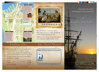
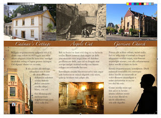
My very first InDesign brochure - "Sydney Convicts"

One of my first assignments for "Language and Systems of Communication" class at Billy Blue was to create a brochure, promoting a walking tour around Sydney. But it's not any kind of tour. This walking trail follows the steps of the convicts that first settled the Australian lands.

After hours of battling and occasional "aha" moments with InDesign, here is what I have come up with. Click on the images below to download a PDF file of the brochure (2.4Mb).

Front and back view:

Inside view:
The PDF file produced is ready for print. It's done using CMYK color mode, and it contains print marks in the edges of the document. It also accounts for the images "bleeding" off the paper, which means the images go beyond the cutting borders to avoid unprofessional while lines between paper edge and the image.

To achieve this "print ready" format, I did the following:
1. When in InDesign, press Command+E to export the file as PDF
2. In the "Export Adobe PDF" window go to "Marks and Bleeds"
3. Check "All Printer's Marks" checkbox

That's all. After saving the exported file, it comes out decorated with all kinds of neat print marks and color scales.

Semester 1: Language and Systems of Communication, taught by Rob Tossen

The "left" and "right" of our brain

I was reading Betty Edwards's book today "Drawing on the Right Side of the Brain", and it got me thinking. It talks about how the left side of the brain and the right side are responsible for different kinds of perceptions. Left side is the logical and analytical. Right side is spacial, "in the now." Right side is the one we use when "seeing" for drawing.

Now, what if I did more things with my left hand? What if I purposefully sought out activities that develop the right side of my brain? Would my life and world perception change?

These are the questions I am pondering on, as I am motivating myself to pick up a pencil and start drawing. It's a "love and hate" relationship I have with drawing. I posses a burning desire to learn how to draw (beyond the childish doodles I produce now), and yet almost every time I am with a pencil I just want to stop. Perhaps it's the struggle of the left and the right sides of my brain... Which will I lead to victory?

This idea of the different roles of our brain was also explored by Jill Taylor in her Ted speech in February 2008. Here is the video of her presentation:


Hope it is as inspiring to you as it is to me.