The Brief:
Create a script for a 30-second radio commercial for glow in the dark condoms. Target audience is 18-25 year olds. Then, use recording studio facilities to record your radio ad.
Creative Process:
Working in groups of 4, we brainstormed how we could come up with something humorous and catchy. We came up with some slogans, such as "light up your night" and "get the party started." In the end, we went with the play-on-words of "night" and "knight," and our main theme of the ad revolves around the Dark Knight.
Final Outcome:
Click on the "Play" button below to listen to the radio ad recording :)
Thursday, September 25, 2008
Monday, September 15, 2008
Oliviero Toscani: provoking man
 This is the face of Benetton's advertising campaign for 18 years. Oliviero Toscani may not be known as well the "United Colors Of Benetton" campaign, but he is the father and the creator of every pixel and square inch of it.
Toscani's goal was always to invoke feelings and emotions through his visual work. He wanted his images to start debates and make people shift their moral values.
Toscani started working in Italy in the 1970's as a photographer. Soon he was ready to take his photography and ideas to the next level, and he needed a friend with deep pockets to support his work. Luciano Benetton was exactly that. For 18 years Luciano and Oliviero were like brothers, even living under the same roof for some time (much to the displeasure of Toscani's wife). During this time, Oliviero Toscani produced a huge number of ads for Benetton campaign, each more controversial than the previous, and made Benetton the 5th most recognized brand in the world.


This happy "marriage" ended in 2000, when Toscani's ambitions took him to American prisons to photograph death row prisoners. He used images and film footage that he collected to produce brochures and poster advertisements, featuring inmates sentenced to death. His message was clear: "abandon capital punishment." Luciano Benetton did not share his views... After extensive financial pressure from the American markets, and Sears pulling out of a deal to open 800 outlet stores, Benetton made his choice.

Now, almost 10 years later, the brand "Benetton" lives on. Luciano Benetton hired a new set of graphic alchemists to look after his brand, while Oliviero Toscani lives and works peacefully at his house in Tuscany, Italy.
Labels:
ads,
advertising,
benetton,
brand,
campaign,
controversial,
luciano benetton,
oliviero toscani,
toscani
Sunday, September 14, 2008
Adbusters: "Buy Nothin Day" proposal first draft
The Brief:
Write a proposal to Adbusters magazine for creation of a cross-track poster, advertising Buy Nothing Day (BND).
Short History:
In America, the day after Thanksgiving is a memorable one to many people. They stand outside during cold early morning hours, queuing up outside of Wal-Marts and hunting for bargains. In Europe, it is the Saturday in late November that suffers most from the shopaholic’s invasions. This day is also important for Humanity, perhaps one of the most significant days. It decides whether we continue living on Earth, or vanish from its surface, erased by toxic fumes and lack of resources to sustain us. It is BUY NOTHING DAY.
Started in Vancouver in the early 1990s, Buy Nothing Day is now an international event supported by more than 65 counties. Buy Nothing Day is not about abstaining from shopping for a single period of 24 hours, and then moving into a new day hungry for “stuff.” It’s about spending the day in contemplating and questioning our purchase choices, breaking our shopping habits and raising awareness of our behavior as typical consumers.
Normal Target Audience:
Kalle Lasn, Adbusters very own, defined Buy Nothing Day target market as “the 20 percent who consume 80 percent of the goodies in the global marketplace” (Revkin, A. C. 2007. A Fresh Adverising Pitch: Buy Nothing, New York Times, link to article). This is generally the young and working population with huge disposal incomes, approximately ages 25 to 35. But why wait so long? Why not deliver the message of over consumption to a younger audience? In our cross-track poster we will target the minds of 18 to 25 years olds, whose attention span is shorter, but impact of knowledge is longer.
Many of these youngsters admit that there is a problem with consumerism in our society, but most of them feel they cannot make a difference. From the beginning of working life, young shoppers need to know that it is them, who control the market. They have a choice, when it comes to making educated decisions about what to buy and what to leave on the shelf.
Buy Nothing Day Media:
Below is some NBD media to feat your eyes on, until our killer poster is available.
"Story Of Stuff" Video (www.storyofstuff.com)
Labels:
adbusters,
billy blue,
BND,
buy nothing day,
consumerism,
semester 1
Saturday, September 13, 2008
Johann Gutenberg's Story

Let's talk typography. After spending two hours today walking around the streets and collecting typogaphy samples, my eyes are now starting to invent letters where there are none. Here is a sample of Blackletter type found up the street. Mmm, beautiful!

Now, who is Johann Gutenberg, and what does he have to do with my quest? Some would call Gutenberg the father of printing press, and I must agree. Gutenberg took typography to a whole new level. While there are speculations on whether he was in fact the first man to get the idea of printing press, aside from the Chinese, I say that it doesn't really matter if he invented printing press or got the idea elsewhere. The important thing is that he actually EXECUTED the idea, and brought printing to live.

Johann Gutenberg's early years are somewhat of a mystery. Born in Mainz around 1400, he was the youngest of 3 children. His father was a Companion of the Mint (coin makers), while his mother was a daughter of a storekeeper. Hence, from the young years Gutenberg's life had an element of duality in it. He was not fit to mingle among the Mint, and yet he was not able to inherit the store either, since he was the youngest child. Instead, he was sent away to study to become a Priest.
While Johann Gutenberg was a deeply religious man, he always had an interest in improving the space around him, and in making things by hand. It didn't make sense to him, when he was told that "God" is the only one who can introduce innovation, and that men should not fill their minds with such heretical thoughts. Gutenberg's ambition was to set the "word of God" into precise order and alignment. He observed numerous errors made by the scribes, and sought to correct these errors by setting the type in metal, and delivering the books "as God intended."

How did he do it? What was Johann's Gutenberg's path to becoming one of the greatest inventors of all time? What motivated him?
Some may prefer to hold an image a man completely dedicated to improving humanity, where as I am more keen on accepting the motivations of gold. Gutenberg wanted to automate the printing process so he could print (and SELL) hundreds of copies of The Book. The invention did not happen overnight either. It took him 20 years of trial-and-error to refine the process and the lead formula.
In the end, Gutenberg succeeded, an "Gutenberg Bible" is the hard evidence. And no, he did not get to enjoy the riches, since the printing business was taken away from him by his late sponsor Fust. If it's any consolation, Johann Gutenberg is now considered one of the greatest inventors and most significant men in the development of Human Kind.
References:
Man, J. 2002. The Gutenberg Revolution, Headline Book Publishing, London
Meltzer, M. 2004. Great Inventions: The Printing Press, Benchmark Books, Torrytown, NY
Morrison, B. 2000. The Justification Of Johann Gutenburg, Chatto & Windus, London
Labels:
billy blue,
gutenberg,
johann gutenberg,
printing press,
semester 1,
typography
Wednesday, September 10, 2008
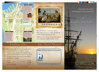
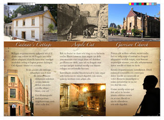
My very first InDesign brochure - "Sydney Convicts"
One of my first assignments for "Language and Systems of Communication" class at Billy Blue was to create a brochure, promoting a walking tour around Sydney. But it's not any kind of tour. This walking trail follows the steps of the convicts that first settled the Australian lands.
After hours of battling and occasional "aha" moments with InDesign, here is what I have come up with. Click on the images below to download a PDF file of the brochure (2.4Mb).

 The PDF file produced is ready for print. It's done using CMYK color mode, and it contains print marks in the edges of the document. It also accounts for the images "bleeding" off the paper, which means the images go beyond the cutting borders to avoid unprofessional while lines between paper edge and the image.
To achieve this "print ready" format, I did the following:
1. When in InDesign, press Command+E to export the file as PDF
2. In the "Export Adobe PDF" window go to "Marks and Bleeds"
3. Check "All Printer's Marks" checkbox
That's all. After saving the exported file, it comes out decorated with all kinds of neat print marks and color scales.
Semester 1: Language and Systems of Communication, taught by Rob Tossen
After hours of battling and occasional "aha" moments with InDesign, here is what I have come up with. Click on the images below to download a PDF file of the brochure (2.4Mb).
Front and back view:

Inside view:
 The PDF file produced is ready for print. It's done using CMYK color mode, and it contains print marks in the edges of the document. It also accounts for the images "bleeding" off the paper, which means the images go beyond the cutting borders to avoid unprofessional while lines between paper edge and the image.
To achieve this "print ready" format, I did the following:
1. When in InDesign, press Command+E to export the file as PDF
2. In the "Export Adobe PDF" window go to "Marks and Bleeds"
3. Check "All Printer's Marks" checkbox
That's all. After saving the exported file, it comes out decorated with all kinds of neat print marks and color scales.
Semester 1: Language and Systems of Communication, taught by Rob Tossen
Labels:
adobe,
australia settlers,
billy blue,
brochure,
indesign,
portfolio,
print,
semester 1,
sydney convicts
The "left" and "right" of our brain
I was reading Betty Edwards's book today "Drawing on the Right Side of the Brain", and it got me thinking. It talks about how the left side of the brain and the right side are responsible for different kinds of perceptions. Left side is the logical and analytical. Right side is spacial, "in the now." Right side is the one we use when "seeing" for drawing.
 Now, what if I did more things with my left hand? What if I purposefully sought out activities that develop the right side of my brain? Would my life and world perception change?
These are the questions I am pondering on, as I am motivating myself to pick up a pencil and start drawing. It's a "love and hate" relationship I have with drawing. I posses a burning desire to learn how to draw (beyond the childish doodles I produce now), and yet almost every time I am with a pencil I just want to stop. Perhaps it's the struggle of the left and the right sides of my brain... Which will I lead to victory?
This idea of the different roles of our brain was also explored by Jill Taylor in her Ted speech in February 2008. Here is the video of her presentation:
Hope it is as inspiring to you as it is to me.
Labels:
art,
betty Edwards,
brain,
drawing,
jill taylor,
right side of the brain,
ted
Subscribe to:
Comments (Atom)


